Bohemian Waxwing in Colored Pencil
A while back, I completed a colored pencil drawing of a bohemian waxwing. This was a custom portrait, not only for the original piece itself, but also to create some custom cards for another local business. Many of us may be familiar with waxwings here in North America — either the bohemian waxwing or the cedar waxwing. Bohemian waxwings live a nomadic lifestyle, traveling in groups to find new sources of food in a variety of different habitats. It is often difficult to predict where they will show up, but they’re almost always in search of fruit like mountain ash berries. In North America, their breeding populations are very far north (as far as northern Alaska and the Yukon) and their winter/non-breeding range dips down into the northern United States in areas like Washington, Montana, Wyoming, Colorado, North Dakota, Minnesota, Vermont, Maine, and more.
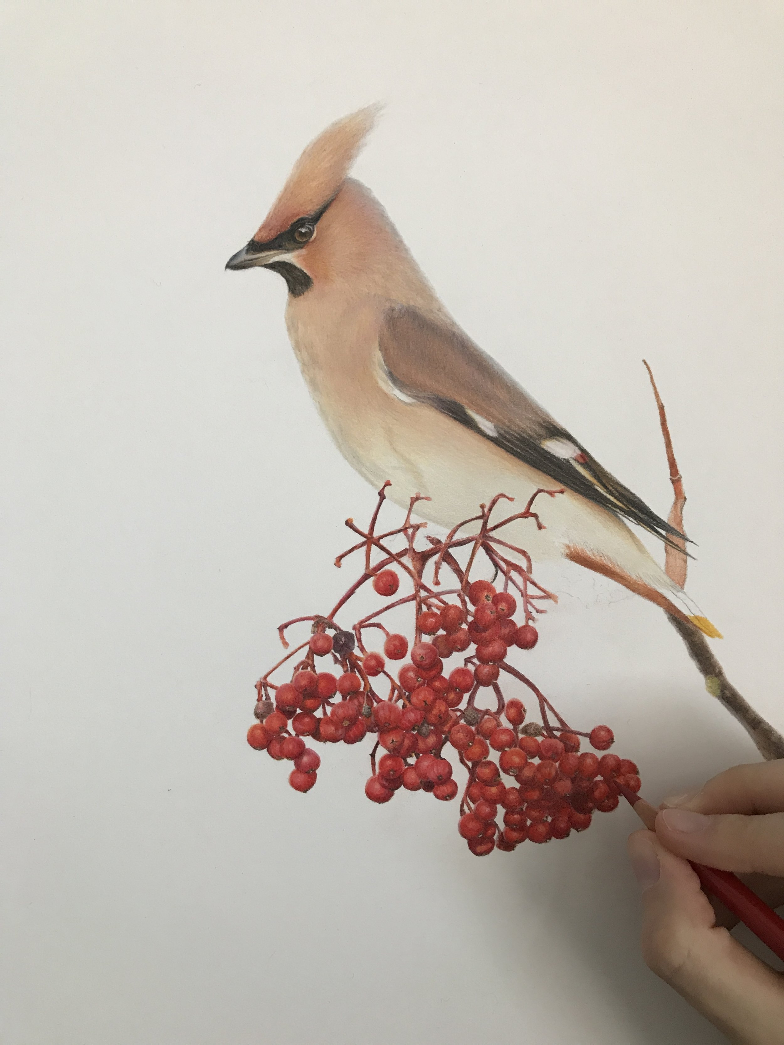
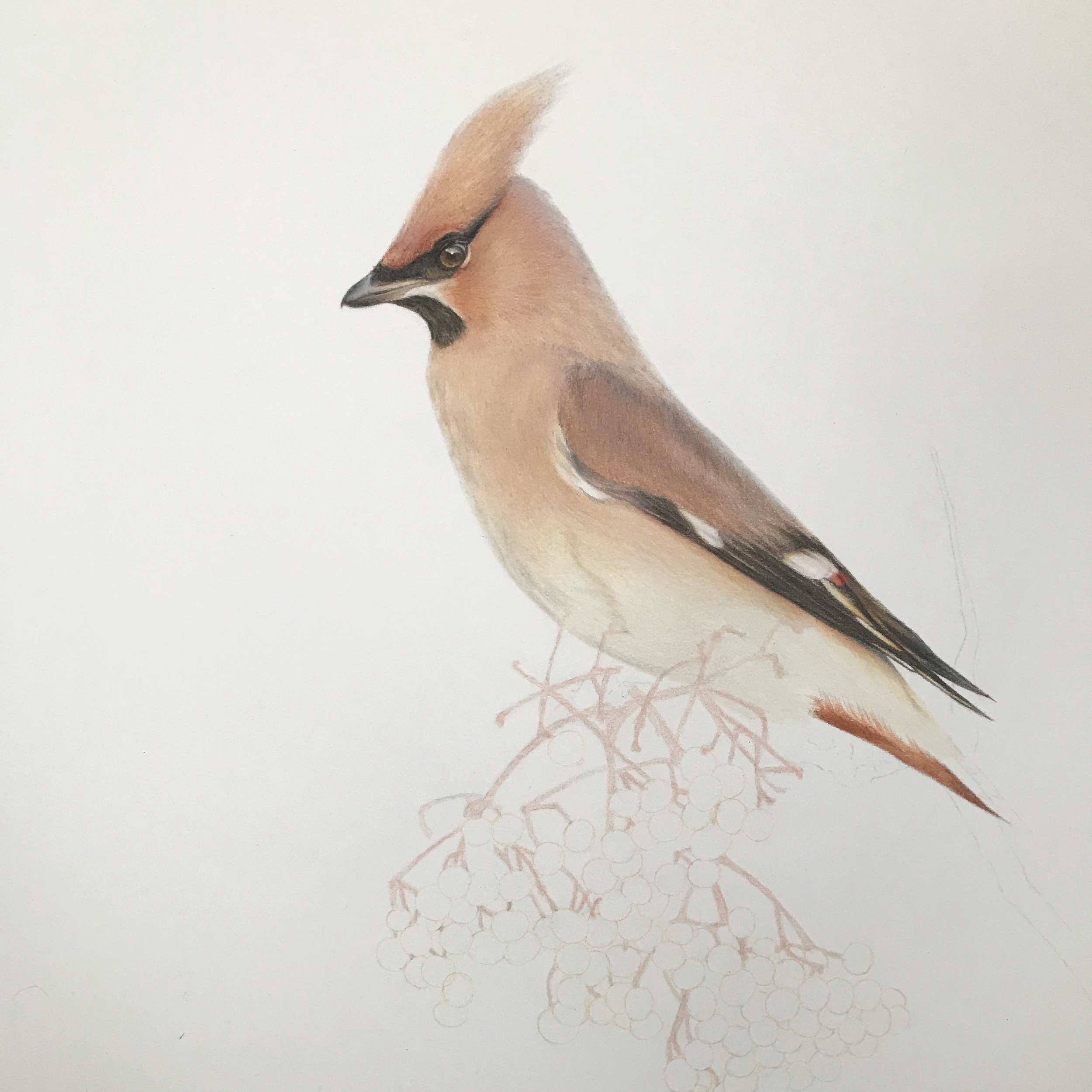
One of the challenges in drawing waxwings is that their feathers are a type of smooth texture that is very unique and can be difficult to replicate. As you can see in my first progress photo, the head and wing have a lot more layers than the chest/neck at that point in time. The chest probably had 4 layers or so, but needed a lot more light layers in order to get that smooth feel of the waxwing feathers. In the second photo, I have added many additional layers to try and build up the proper color. While I primarily use Faber-Castell Polychromos in all of my colored pencil portraits, I did use a fair amount of Caran D’ache Luminance and Pablo pencils to achieve the buff/beige colors of the waxwing.
Two pencils I relied on heavily were the Luminance Brown Ochre 10% and the Luminance Violet Grey. The Brown Ochre 10% gives that nice, warm beige color. The Violet Grey was used primarily on the wings and in any shadow areas as it gives a nice contrast to the yellow hues coming from the ochre. You can see the Violet Grey at the back of the waxwing’s head/neck, in the subtle shadows along the shoulder, and creating the shape and shadows of the wings.
Once I got to the point of starting on the berries (which look like mountain ash), I used a base color (Polychromos Cinnamon) to map out the berries and the stems. While I enjoyed drawing the berries quite a bit, I found they were actually tougher on my hand because I was able to use more pressure with the pencils than I normally do. They were a bit of a headache to map out, but I try to remember that with parts like this, every single thing does not have to match the reference photo perfectly. I follow my reference photo, but I don’t mind if there are a few differences here and there.
In addition to mapping out the base tones for the berries, I also mapped out where there were bottoms of the berries. Some of them had a darker area visible, so to help my own head through this process, I added those so I could keep track of the way my shadows and highlights needed to be drawn. As you can see, the photo from this time was not very good and taken under a daylight lamp since it gets dark much earlier these days.
Once I mapped out the remaining berries, I began to build up the color int he berries using a variety of pinks, reds, oranges, deep maroons/violets, and using a white pencil to help burnish the berries and make them look shiny. I used fairly moderate pressure for the berries to help speed up the process, whereas I used light pressure for almost all of the waxwing itself, with the exception of a little bit of moderate pressure to help fill the tooth of the paper and smooth the feathers out.
The last thing was to try and fill in the gaps where the branch existed and the waxwings feet were perched. It was very hard to see this in the reference photo, so I tried to imagine where the feet would be and tried to not focus too much on details, but on filling in the area with color as it was in the photo. This area of the reference photo was fairly dark since the waxwing was creating a shadow over its feet, so I felt it was most important to try and create the illusion of detail while not getting too hung up on perfection.
I used light strokes along the side of the tail to create the junction where the beige feathers lay over the rusty area underneath the tail. I started with the beige color going into the rusty area, but then brought my orange/red/burnt sienna to the paper and used light strokes upward to make it seem like the lighter beige feathers were laying over that area.
Here is a scan showing the final piece. If you have any questions on techniques I used, please feel free to ask! This is “Plenty to Share” [11”x14” in colored pencil, original piece is sold]. Notecards are available for sale in the shop!


